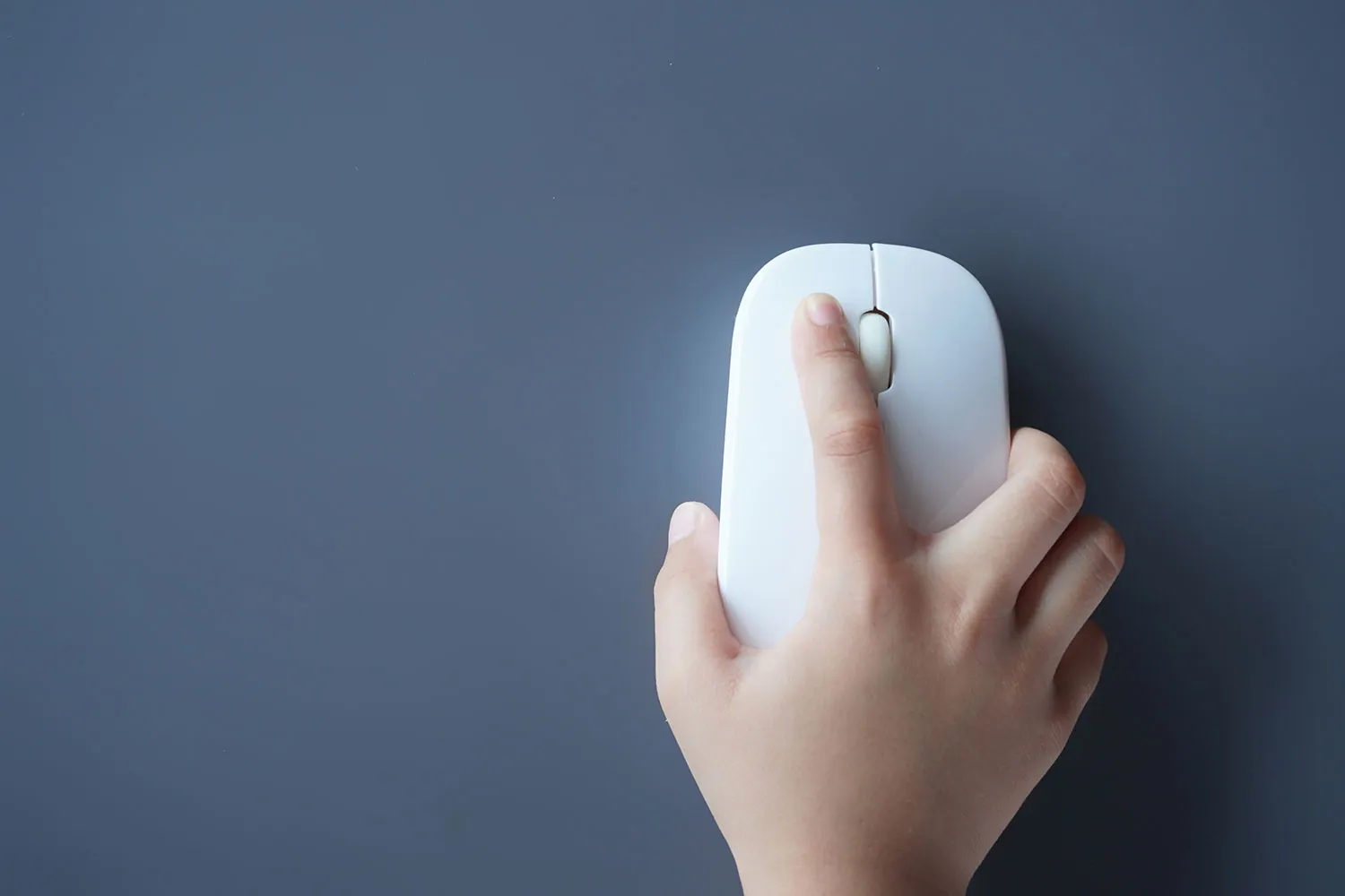
The double-click is a clumsy gesture from the floppy-disk era with no place in modern UX. As interfaces evolve towards AI, touch and simplicity, it is time to bury the double-click for good. If you are still designing for it, you are designing backwards.
Let's be honest: the double-click is dead. And if it isn't, it should be.
What began as a clever way to tell selection from activation on 1980s desktops has somehow survived decades of UX evolution. But in 2025? It is a usability fossil.
We don't double-tap apps on our phones. We don't double-click buttons on the web. We swipe, tap, long-press, use voice commands and gestures. But double-click? That is a mouse-flavoured ghost of the past.
A UX Crutch from the Beige-Box Era
To understand why the double-click lasted so long, you have to go back to the beginning. In the early days of graphical user interfaces, the mouse was still new. You had one button (two if you were lucky), a clunky CRT and no obvious way to distinguish "highlight this" from "open this".
Enter the double-click: a clever fix for a limited input system. It made sense. Back then.
Today's interaction landscape is far more advanced: mobile touchscreens, mixed input modes, AI-driven prediction, haptic feedback, accessibility-first design. Yet somehow the double-click still lurks in file explorers, buried in OS defaults and, embarrassingly, in some legacy web apps.
Mobile Killed the Double-Click Star
Let's talk mobile, the boot camp of modern UX. On a smartphone every interaction counts. There is no room for redundancy and no tolerance for confusion. You tap, swipe or press. Anything more nuanced? Gone. There is a reason iOS and Android designers never even considered the double-click.
Why? Because it isn't intuitive. It creates micro-failures: users miss the timing, go too fast or too slow, and the system doesn't respond. On a phone that would be a disaster. On a desktop it is just irritating.
Speed ≠ Usability
Double-click advocates will argue it is faster: you select and launch with a quick flick of the finger. But speed only matters if the gesture is reliable, and the double-click is notoriously fickle. OS settings vary, click speed differs from user to user and beginners often get it wrong.
It is especially harmful for accessibility. Older users and people with motor impairments often struggle to double-click consistently within the time window the OS sets. That isn't just bad UX; it is exclusionary design.
Why Is It Still Here?
Because OS vendors won't let it go. Windows still uses the double-click as the default to open files. Mac users still do it out of habit, even though a single click is often enough in the modern Finder. And corporate environments? Forget it; they are museums of interaction decay.
The double-click survives because it is the path of least resistance for engineers, not for users. It is deeply embedded in system logic, file explorers and old mental models. It isn't there because it is the right choice. It is there because nobody dared to kill it.
Web Designers Have Already Moved On
Fortunately, web UX designers quietly buried the double-click years ago. Try double-clicking a button in any modern web app: nothing different happens. At most you will select a word.
Progressive web design relies on clarity and speed. The fewer interaction steps, the better. Taps and clicks are minimised, not duplicated. A good interface anticipates intent; it doesn't make you prove it twice.
And with gesture-based interfaces, voice commands and AI assistance on the rise, there is no cognitive room left for an archaic "double-click to confirm" mechanism.
The Final Nail: AI and Predictive Interfaces
AI-driven UX is the bulldozer flattening what remains of double-click logic. Predictive input, contextual menus and smart defaults remove the need for repeated gestures.
Want to open a file? AI can infer it as you hover, glance or even whisper its name. Want to select something rather than activate it? The UI should adapt, not force you to memorise interaction rules from 1984.
The double-click is fundamentally anti-AI. It says, "I don't trust the interface to understand me unless I press twice."
What Should Replace It?
We already have the answers:
Single click for everything: make the UI smart enough to know which action is likely.
Contextual UI: offer intent-based actions when needed, through hover, right-click, tap-and-hold or dynamically generated toolbars.
Long-press and hold to confirm: already common on mobile, more reliable and easier to discover.
Touch-first design language: even on desktop. Imagine how it would work on a touchscreen, then scale it to the mouse.
For Designers: Stop Perpetuating This Nonsense
If you are designing a desktop or web experience in 2025 that relies on the double-click, you aren't being nostalgic; you are being lazy.
Design isn't about preserving rituals. It is about removing friction.
The double-click isn't a shortcut. It is a UX tax, a relic of a time when our tools were simple and our UIs simpler still. When building experiences for today's users, stop asking them to click twice when once is enough.
Conclusion: The Double-Click Is a Sign of a Broken Interface
Like pop-ups, endless dropdowns and "Are you sure you want to delete this?" confirmations, the double-click is a red flag. It doesn't create clarity; it creates dependency. It doesn't respect user intent; it imposes learned behaviour.
Good UI communicates. Great UI anticipates. Outdated UI demands obedience.
The double-click? It is the last of these. Let it go.